

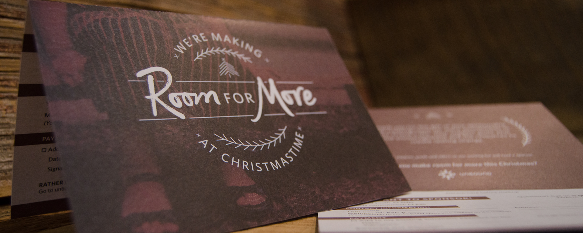
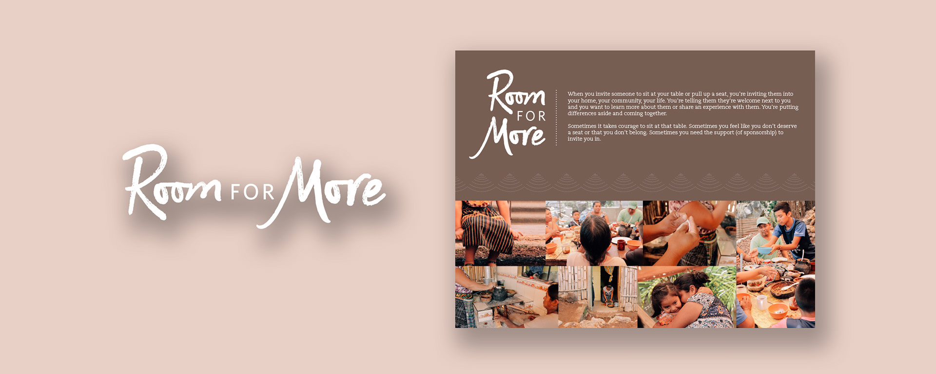
I created the wordmark for this campaign and the overall style. This included how the photos were edited, the color, and the various assets like patterns and icons. I found this color brown particularly important because it promoted a warm and organic feeling. My goal was that it would stand out from other winter campaigns that would use blue or Christmas campaigns that would use green and red.

Around Christmas, every sponsor receives a Christmas card from their sponsored friend. We also sent this Christmas card along with it to thank them for their support over the past year. We highlighted how important sponsorship is, and also asking if they could sponsor another friend.


I designed the layout of the two websites we used for Room For More. The left is focused on donations and the right is focused on sponsorship. The icons used were made specifically for this campaign.
I edited the photos and prepared them for use on our social platforms and emails.